A Radar Chart often known as Spider Chart is a good tool to showcase competencies with respect to a central value. For example, if you run a website, you can show how you have covered reach, readability, bounce rate, new user, etc. in one simple chart. And Radar Chart is even better if you compare the same data with the last time period’s data. Excel provides 3 Radar/Spider Chart types. Radar, Radar with markers and filled Radar.

Let’s check out the excel radar chart to make things clear.
Example: Show Websites Performance On Radar Chart
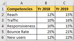
So, I have some data on my web site's performance last year and this year. I need to show how much this year's performance overshadows last year's performance. My data consists of percentage of reach, traffic, responsiveness, bounce rate, and new users.
So let’s plot a radar chart in excel on the basis of this data.

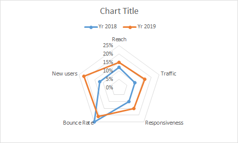
For now, we want to compare the data with last year's data on the radar chart. To do so we need to see each point on the chart. Hence we will use a Radar Chart with markers.
And bam, there you have a radar chart.

In the above chart, each corner represents a competency and each circle represents a level, starting from 0%.
We can see that 2019’s performance has taken over each competency except the bounce rate (which is good) in compare to 2018’s performance of the website. You can delete the level/steps if you like, it's just confusing. Select it and hit the delete button.

Now it is cleaner.
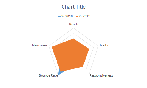
So this was a simple radar/spider chart in excel. Here we wanted to see both year’s data. If you just want to see how 2019 is covering 2018 then filled radar chart would be perfect.

The above chart shows how 2019’s data is excelling on the 2018’s data. Only bounce is reduced in 2019 as compared to 2018, which is a good thing.
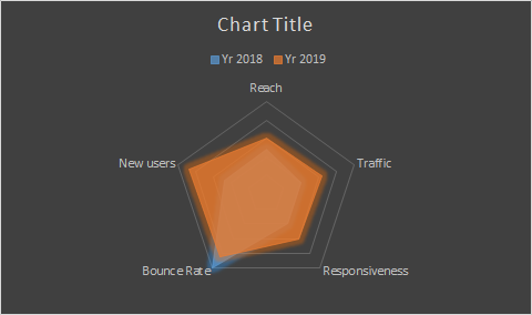
Now if you be a little bit creative you can create this kind of radar chart too. Actually it is already available in the designs option.

Benefits of the Radar Chart:
Disadvantages of a Radar Chart:
So yeah guys, this how you can use radar chart in excel to impress your clients. Make you dashboard more attractive and play smart with you colleagues. Let me know if you need any help on this topic or any other excel chart topic in the comments section below.
Related Articles:
Excel Sparklines : The Tiny Charts in Cell
Speedometer (Gauge) Chart in Excel 2016
Creative Column Chart that Includes Totals
4 Creative Target Vs Achievement Charts in Excel
Popular Articles:
The applications/code on this site are distributed as is and without warranties or liability. In no event shall the owner of the copyrights, or the authors of the applications/code be liable for any loss of profit, any problems or any damage resulting from the use or evaluation of the applications/code.