In Excel 2016, Microsoft presented two hierarchical chart types. Sunburst chart and Treemap chart. In this article, we will learn when and how to use Excel Treemap chart.

A treemap chart consists rectangles of different size and colors. The color of the rectangle represents the super group and the size of rectangle represents the percentage of total super group. For example, if blue color represents North then all blue rectangle represents whole North's data. And if North has same number of sedan cars and hatchback cars then they will be of equal sized blue rectangle.
To make it clear let's have an example.
Example: Plot a Treemap chart in Excel
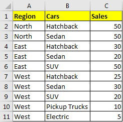
Here I have a sample data of different cars sales in different region of Country. We have three regions; North, East and West. And we have different types of cars like hatchback, sedan, SUV, etc. . To keep it easy to understand, I have taken small number of categories and numbers.

To plot a treemap chart follow these steps:

And boom! You have your hierarchy chart.

Interpretation of Treemap Chart
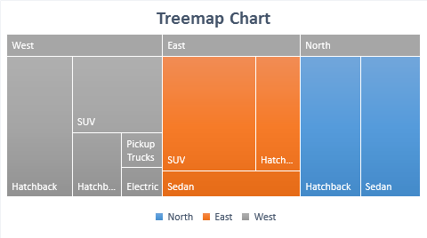
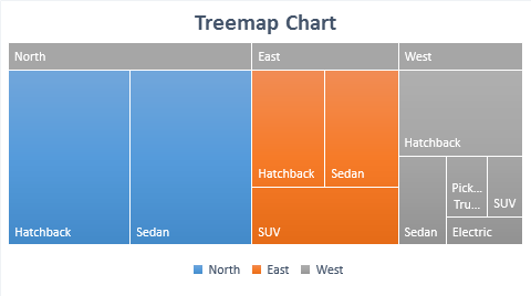
In above diagram, each color represents a different group. This is also marked with legends.
Here Blue is North, Orange is East and Grey is West. Now each color is consists different sized box. These boxes represent the share they hold in 100% of the color. For example, the blue color occupies most of the area hence North has larger sales in among all the regions. In north, 50 of both hatchback and sedan cars are sold and they are represented using same size of blue rectangles. This means both hold 50% of share in north. Similarly for all the colors.
When to use Treemap Hierarchical chart of excel?
Use Excel Treemap Diagram to visualise Hierarchical data types. When you have several categories and sub categories, treemap can be used to representation of such data. The Treemap chart utilizes all the space available on chart area.
Note:-- Do not use when variance is too much between categories. The smaller categories may not be visible to human eyes on diagram.
No numbers are shown on the chart and its hard to determine difference in size when they are almost same but not the same.
To many categories and hierarchy can lead to confusion.
So yeah guys, this how can use a treemap diagram in excel to represent a hierarchical data. At first, it may seem confusing but once you get used to it, you'll fall in love with this excel chart. Anyway, if you have any doubts or special requirement, do let me know in the comments section below.
Related Articles:
Excel Sparklines : The Tiny Charts in Cell
Speedometer (Gauge) Chart in Excel 2016
Creative Column Chart that Includes Totals
4 Creative Target Vs Achievement Charts in Excel
Popular Articles:
The applications/code on this site are distributed as is and without warranties or liability. In no event shall the owner of the copyrights, or the authors of the applications/code be liable for any loss of profit, any problems or any damage resulting from the use or evaluation of the applications/code.