In this article, we will learn New Sparkline Features in MS Excel 2010.
What is Sparkline ?
Since this features was wanted by many users, the sparklines for excel, were created with easy use options. The mini graphs look best when placed at the end of the data columns. So choose the last column of the spread sheet to insert the sparklines. Choose the sparklines to be lines or columns or win/loss representations.
A dialog box pops up where you have to enter the data range. Select the cells containing data that need to be represented in the sparkline miniature graphs. In the location range, select the cells in which the mini graphs need to be shown.
Once you hit the ok button, you might see weird graphs not showing the right representation. In that case, got to Axis option and set it at General Axis type for the horizontal axis and Automatic for Each Sparkline for both vertical maximum and minimum.
After insertion, the style, colours and other visual appeal can be changed easily. Features such as high points, low points negatives, values, etc help to highlight the particular data that you want to visually highlight for the viewer. You can also change the line or bar’s colour.
… Function in Excel
The Sparklines are the small charts that reside in a single cell. Sparklines are used to show trends, improvement and win loss over the period. The sparklines are charts but they have limited functionalities as compared to regular charts. In spite of its limitations, sparklines provide features like highlighting, min and maximum points, first point, last point and negative points.There are many other features sparkline provides which we will explore in this article.
Since the introduction of sparklines in Excel 2010 it has evolved. I am using excel 2016 and I will explain these in cell charts in this version.
How To Insert Sparkline Chart in Cell

Now you have your sparkline chart in one single cell.
Some points you should know about these in cell charts.
Types of Sparkline Chart in Excel
There are three types of Sparklines in Excel.

Note: The column and win loss sparkline may look similar but they are different. The win-loss sparkline does not reflect magnitude or values in charts. It just shows the binary values. Everything positive is one and everything negative is -1.
In the above image, the win-loss sparkline shows that if we have done better in 2019 or worse as compared to 2018.

Highlight Points in Sparkline
It is common but important to highlight points in graphs, so that you can grab attention of management and help make better decisions. The sparkline in excel provides this feature too. You can highlight these below points in these in-cell charts.

Handling Empty Cells in Sparkline
By default, If your data contains empty cells, the sparkline is shown broken, if its a line sparkline. Other sparkline just don’t show that point. Hidden cell points are ignored and not shown in the graph.

Excel provides option to handle these cases.


You can clearly see, the blank cell is ignored here. The excel sparkline is only showing four points.
Axis in Sparkline
By default, all the points in the graph shown relative to smallest point in sparkline. For example in below data, 2147 is the smallest point. You can see, it is shown to low on graph. But it, itself a large point.

You may not want this to happen. You would like set an axis as 2000, as all values are above this value. Excel gives you the option you to set lowest or highest point of sparklines.
Follow these steps to edit Axis of Sparkline:

 Hit Ok.
You can see the change now.

Change Data Source And Location of Sparkline
So, if you want to change data source or location, you can do that too.

Sparkline Formatting
There is some scope of formatting the sparkline charts.
How to change sparkline type?
To change a sparklines type follow these steps.

How to change sparkline style?
Sparklines have some predesigned styles. You can change the design of sparklines following these steps.

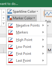
How to change sparkline’s color and marker color?
And it’s done.

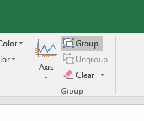
How to group sparklines?
Once you group the sparklines, all of them will be formatted same as the upper-left sparkline.

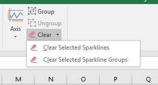
How to Delete a Sparkline?
You can’t delete the sparkline by simply pressing delete key on keyboard. To delete a sparkline chart follow these steps.
You can also delete the cell, column or row that contains the sparkline to delete it. Just make sure it doesn’t affect your data.

So, this is all about the sparkline in Excel. If you have any sparkline tricks under your sleeves, please do share with us in the comments section below.
Notes :
Sparklines created in Excel 2010 won’t show in earlier version of Excel. That is, if you are using 2010 version and your client is using 2007 version, he or she cannot view these sparklines at all as the earlier versions do not support the new sparkline features.
That is the only real problem. Therefore, as an added option, using third party softwares to create sparklines for Excel might be a feasible option until more people are using Excel 2010 in majority.
Hope this article about New Sparkline Features in MS Excel is explanatory. Find more articles on Excel charts and related Excel formulas here. If you liked our blogs, share it with your friends on Facebook. And also you can follow us on Twitter and Facebook. We would love to hear from you, do let us know how we can improve, complement or innovate our work and make it better for you. Write to us at info@exceltip.com.
Related Articles:
Best Charts in Excel and How To Use Them : These are some of the best charts that Excel provides. You should know how to use these charts and how they are interpreted. The line, column and pie chart are some common and but effective charts that have been used since the inception of the charts in excel. But Excel has more charts to explore…
10+ Creative Advanced Excel Charts to Rock Your Dashboard : These creative charts can make you stand apart from the crowd. These charts can be used for different types of reports. Your dashboard will be more expressive than ever.
How to Save and Use a Excel Chart Template : It is important to save chart templates for repetitive charts to save time and energy. To save chart templates in excel follow these steps.
4 Creative Target Vs Achievement Charts in Excel : These four advanced excel charts can be used effectively to represent achievement vs target data. These charts are highly creative and self explanatory. The first chart looks like a swimming pool with swimmers. Take a look.
Excel Sparklines : The Tiny Charts in Cell : These small charts reside in the cells of Excel. They are new to excel and not much explored. There are three types of Excel Sparkline charts in Excel. These 3 have sub categories, let's explore them.
Change Chart Data as Per Selected Cell : To change data as we select different cells we use worksheet events of Excel VBA. We change the data source of the chart as we change the selection or the cell. Here's how you do it.
Popular Articles :
How to use the IF Function in Excel : The IF statement in Excel checks the condition and returns a specific value if the condition is TRUE or returns another specific value if FALSE.
How to use the VLOOKUP Function in Excel : This is one of the most used and popular functions of excel that is used to lookup value from different ranges and sheets.
How to Use SUMIF Function in Excel : This is another dashboard essential function. This helps you sum up values on specific conditions.
How to use the COUNTIF Function in Excel : Count values with conditions using this amazing function. You don't need to filter your data to count specific values. Countif function is essential to prepare your dashboard.
The applications/code on this site are distributed as is and without warranties or liability. In no event shall the owner of the copyrights, or the authors of the applications/code be liable for any loss of profit, any problems or any damage resulting from the use or evaluation of the applications/code.