In this article we will learn about the how to prepare the repair log report in Microsoft Excel 2010 and 2013.

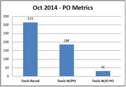
Chart:- PO Metrics

Column chart used to show the PO metrics, where we can see the numbers according to Tools received, Tools W/PO and Tools W/O PO month wise.
Through this chart we can see the numbers of tools:- Tools Received is 315, Tools W/PO- 186 and Tools W/O PO is 31.
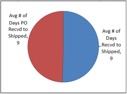
Chart:- Average days of PO Recvd to Shipped

Pie chart used to show the average of days PO received to ship and average of days received to shipped.
Chart:- Recvd VS Shipped

Bar chart used to show the comparison in between received vs shipped. Through this chart we can see that Total received is 315 and total shipped is 157.

In the matrix tab we can see the summary of data such as:- Total tools received, Total tools shipped, total repairs received W/PO, % of total tools W/PO, total repairs received w/o PO’s, % of Total tools W/O PO, total items with back-ordered parts, % of total w/back- orders, avg # of the days to receive back ordered parts, avg # of days to ship from date received, Avg # days to ship from date PO received.
The applications/code on this site are distributed as is and without warranties or liability. In no event shall the owner of the copyrights, or the authors of the applications/code be liable for any loss of profit, any problems or any damage resulting from the use or evaluation of the applications/code.
Hello, I enjoy reading all of your post. I wanted to write a little comment to support you.
It's very easy to find out any topic on net as compared to textbooks, as I found this article at this website.
auto-corner.org |