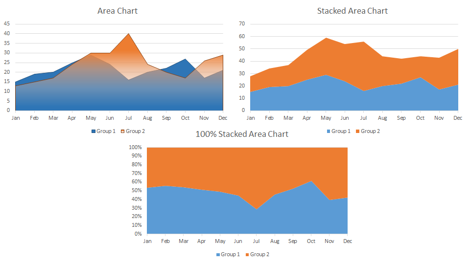
There are plenty of chart types that excel offers to utilize. The most common being Column, Bar, Pie, and Line. Apart from these charts, there’s an Area chart type that has not been explored much in excel. In this article we will learn how to use Excel Area Chart.

The area chart is a variation of a line chart that fills the area below it with a color. It can be plotted to see trends over time. The area chart is not be seen on the ribbon tab. It is under the Line chart category.
Example 1: Plot An Area Chart Of Two Groups
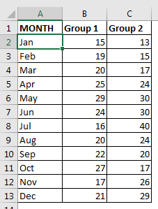
Here I have this data of area covered by two groups for two surveys in different months. These areas can be common. We need to plot an area chart to visualize the area covered by two groups in different months.

Plot The Area Chart:


And it is done.
Interpretation:
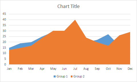
In the above chart, we can see that group 2 is almost covering group 1. This means that group 2 has covered more area in comparison to group 1 in most of the months. Wherever we can see the blue are, their group 1 has covered more area than group 2.
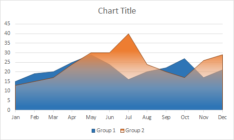
As you can see, we can’t directly compare these two groups but we can just check which group has done better in different months. If you want to see the area chart in the foreground then you can set transparency of the front area.

Example 2: Plot a Stacked Area Chart Of Two Groups
In the above example, the areas were common. If each group had done their survey in two distinct areas, then we would have used Stacked Area Chart. The total area covered would be the sum of the areas covered by these two groups.
To create a stacked area chart we would follow the steps told earlier and finally select the stacked area chart.

Interpretation of Stacked Area Chart
Whatever area we are seeing on the screen is the total area covered by these two groups. Group 1 has covered 15 in Jan month, which is shown using the blue area (0-15). Group 2 covered 13 (15-28). So the total area covered by the two groups is 28 in Jan (0-28). And this is how you interpret the stacked area chart in excel.
Example 3: Plot A 100% Stacked Area Chart Of Two Groups
In the above example, we have seen how much area each group covered. But if we wanted a percentage of the total area covered by each group then we would have used 100% stacked area chart.
To plot a stacked area chart, we will follow the same steps as we did before. In the end, we will opt for 100% stacked chart. Finally we will have this chart.

Interpretation of 100% Stacked Area Chart
You can see the whole chart is filled with two colors. It means it is considering the total of the area as a sum of area covered by both groups. The blue area is covered by group 1 and the rest is covered by group 2. In Jan group 1 covered 54% of available area and rest 46% is covered by group 2.
Best Uses of the Stacked Chart:
Don’t Use It When:
So yeah guys, this how you can use area chart. I have created a sunrise and sunset chart using the area chart. You can check it out in related articles. If you have any doubts or special requirement then use the comments section below to put your queries.
Related Articles:
Excel Sparklines : The Tiny Charts in Cell
Speedometer (Gauge) Chart in Excel 2016
Creative Column Chart that Includes Totals
4 Creative Target Vs Achievement Charts in Excel
Popular Articles:
The applications/code on this site are distributed as is and without warranties or liability. In no event shall the owner of the copyrights, or the authors of the applications/code be liable for any loss of profit, any problems or any damage resulting from the use or evaluation of the applications/code.