Thermometer is used to show the percentage of achievement. It is based on a single cell of achievement and it is best for use in a dashboard to display the progress of everyone that whether they achieved a goal or not.
To prepare the Thermometer chart we have to use the Clustered Column Chart.
Let’s take an example and understand how we can prepare Thermometer Chart.
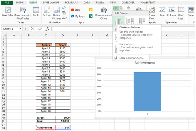
We are having a table in the range C8:D28, cell D30 contains the target value, cell D31 contains total score and cell D33 contains the percentage of target achieved. To create the chart we have to assure that the blank row preceding cell D33, if we fail to include this blank row, Excel will use the entire data block not just the single cell to construct the chart since D33 is out-of-the-way from the other data the chart wizard uses only a single cell.

Follow below mentioned steps to create a thermometer chart;-

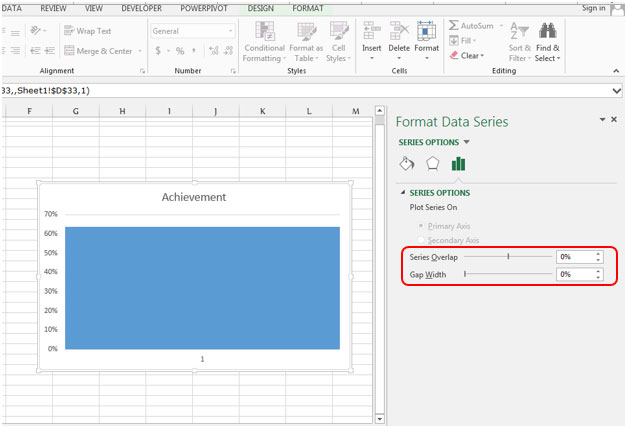
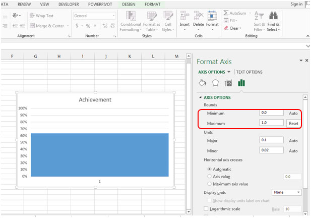
Provide the thermometer shape

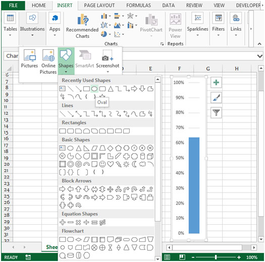

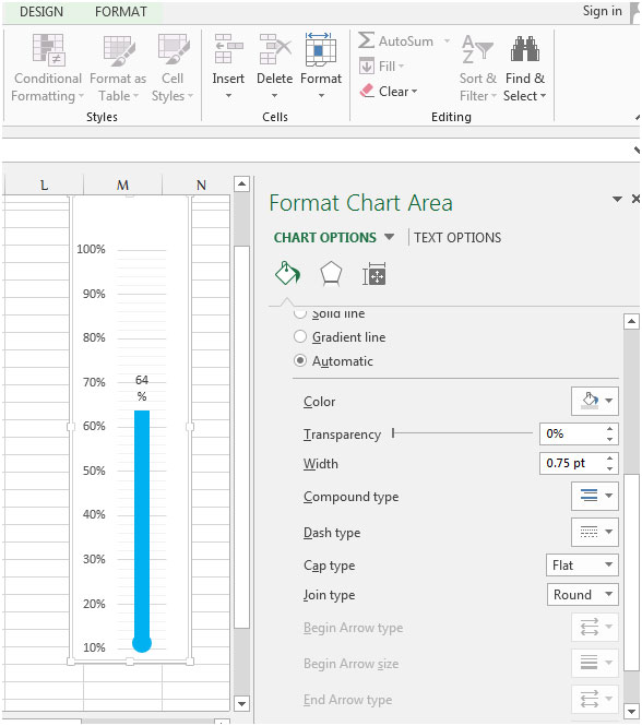

Conclusion:- If you want to show the clear picture of achieved target then this chart will really help you.
![]()
If you liked our blogs, share it with your friends on Facebook. And also you can follow us on Twitter and Facebook.
We would love to hear from you, do let us know how we can improve, complement or innovate our work and make it better for you. Write us at info@exceltip.com
The applications/code on this site are distributed as is and without warranties or liability. In no event shall the owner of the copyrights, or the authors of the applications/code be liable for any loss of profit, any problems or any damage resulting from the use or evaluation of the applications/code.
Oh great! Thanks for this amazing tutorial. I am learning some of the basics of using Microsoft Excel. I will definitely try these methods that you share.